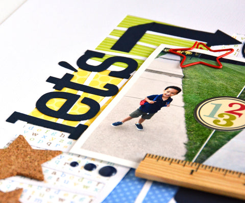
All week on the JustNick Studio blog we have been bringing you Back To School inspiration. Today, it's my turn. I swear, I have the cutest, happiest nephew! Here he is showing off his new backpack.

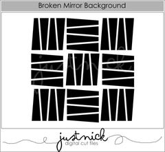
I used 5 digital cut files to create this layout. The Broken Mirror Background cut file allowed me to use up some scraps filling in the negative space with different pattern papers.

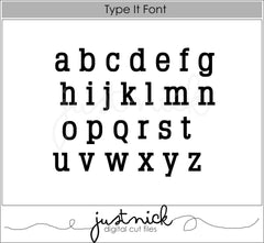
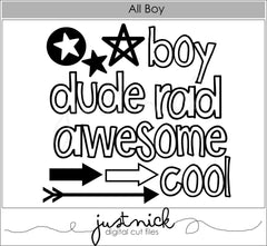
To create movement on my layout, I wanted my title to go up one side of my photo and across the top. To connect the two, I modified the arrow from the All Boy digital cut file, making it much longer. This allowed me to fold it to fit around my photo. I used two different fonts for my title, the Type It Font and the OutLine Alphas. I love mixing fonts to create more interest in my titles.


To finish framing my photo, I tucked the Today File Folder underneath my photo.

Here are the cut files I used today ...


I even have a process video for you. It is part of a Back To School Series with Christine Meyer and Katelyn Clary. Links to their videos will be posted at the end of my video.
Thanks so much for stopping by today! Have a fabulous weekend!


No comments:
Post a Comment
I love hearing what you think!