Here is the line-up ...
Clique Kits https://cliquekits.wordpress.com/
Melissa Goble http://mgphoto89.tumblr.com
*Design Team Members on Kit Duty
I have two layouts to share with you today. This first one features a friend's child whom I scrap often. This picture was perfect for that "I was made to be awesome" journal card. This is a simple grid based layout.... something that works well with the PL cards.
This week Nicole Nowosad challenged us to use 4 different JustNick cut files. These are the 4 that I chose....

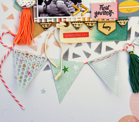
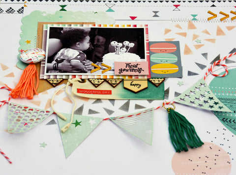
I like to create stencils with the background cut files so I can use inks to add interest to my background. I choose the Shattered Glass Background for this because I wanted to focus on triangular shapes throughout my layout to coordinate with the pattern papers from the PinkFresh Studios Happy Things collection.

Another cut file with triangles is the Basic Banner. Banners really add a festive element to the layout. These banners have such fun repeating shapes too.


To help frame my photo, I chose the Doodle Frames cut file. I cut only the outside of this frame. And how cute are those macaroons!

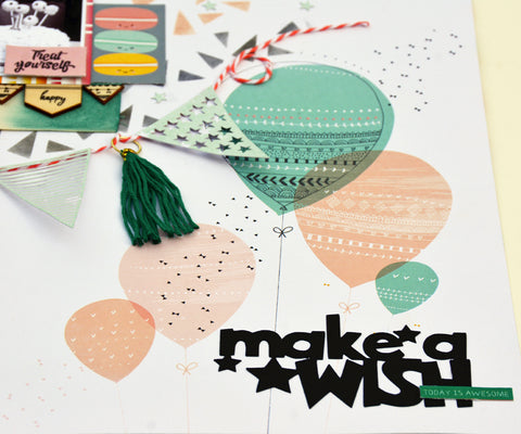
Of course with a birthday layout I would need a birthday title. The Card Sentiments 1 with the "Make a Wish" caught my eye for my photo of my nephew blowing out his first birthday candle.

Thanks for stopping by. The next stop on the hop is Kim Allen.
~Marcia


Love the layouts and those adorable pics. Adorable.
ReplyDeleteLove every layout. That first layout just makes me giggle. Love what you have done with the kit.
ReplyDeleteCute pics and great layouts! Really like your banner with the added tassel- very cute!
ReplyDeleteGreat layouts Marcia!! I really loved the banner you made on the second layout!!
ReplyDeleteYou had me at the details in the banner. Great moments AND fun captured; we are always thinkung about the pefect shot in the back of our minds lol. Love those veneers too!!
ReplyDeleteOh well how fantastic are both these pager... love them...awesome design!
ReplyDeleteOh my goodness how I love that photo in your first page!!! You've showcased it perfectly!!! And the next page is fabulous with all of you masking and use of the triangle shapes! Lovely work!
ReplyDeleteLove all the details in your work
ReplyDeleteWhat a great idea to make a banner!!!! Fantastic Layouts Marcia!
ReplyDeleteThis is so cute. Love the banner with the different cut outs!
ReplyDeleteLOVE how you used that balloon paper, I am still hoarding, um saving that one so good job putting it to use!! :)
ReplyDeleteBoth of these layouts are amazing! That photo on your first one is so funny, totally perfect for that card. I love all the details on your second layout, that banner is gorgeous!
ReplyDeleteBeautiful work!
ReplyDeleteawesome pages!! the pic on that first one is too cute!!
ReplyDeleteThat first one has great emotion to it (and of course it looks awesome too)! And your use of the triangle stencil is spectacular!
ReplyDeleteGreat work. Love your photos and highlighting them with wonderful combinations of elements and embellishments.
ReplyDelete